UI Versus UX – Southern Railway Provide A Terrible Example
Southern Railway recently upgraded their train ticket buying website. The new user interface (UI) is very pretty, and I would guess it’s an easier place to buy train tickets online if you’ve never done that before.
If you buy tickets frequently, and particularly if you need receipts for expenses then it’s a user experience (UX) disaster. Here’s how…
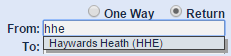
If you know the short code for your station
I live in Haywards Heath, which has a short code of HHE. In the old setup (still used by South Eastern trains) this is what happens:
Southern’s new site also tries to offer me Garelochhead (some hundreds of miles outside their franchise) because it has the letters ‘hhe’ in it.
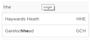
On my first try using the new site I managed to accidentally select Garelochhead, and boy are those trains to London expensive, slow and infrequent.
One way
The old default used to be a return journey. The new one is a single. I find it hard to believe that’s a decision supported by data – people generally want to go and come back.
Too specific
The new site makes you choose a train for each leg of the journey, which was only required if making seat reservations on the old site. Not only is this unnecessary and potentially confusing when buying a ticket or travelcard that offers some choice over when to travel, but it leads to…
The fraudulent receipt
Having made you specify a train for each leg of a journey that information then makes it onto the order confirmation that I expect many people (like me) use as a receipt[1]. That’s fine if you actually end up taking those exact trains, but what if you don’t? I can see a situation arising where a boss approving expenses knows that a particular train wasn’t taken, so the receipt turns into a lie.
The receipt should be for the ticket bought, not the journey (forcibly) planned.
Just take my money
Southern used to store my credit card information as part of my account, but now they make me type it in every time.
and do you really need a phone number?
I can’t think of a time that I’d ever want an online ticket provider to call me.
A booking reference AND a collection reference
and neither of them in the email subject.
When picking up tickets bought online the machine needs a collection reference to be typed in (on the not awfully responsive touch screen keyboards)[2]. This used to be presented at the top of the email:
Now the first thing presented is some totally irrelevant ‘booking reference’ and the vital ‘collection reference’ is further down.
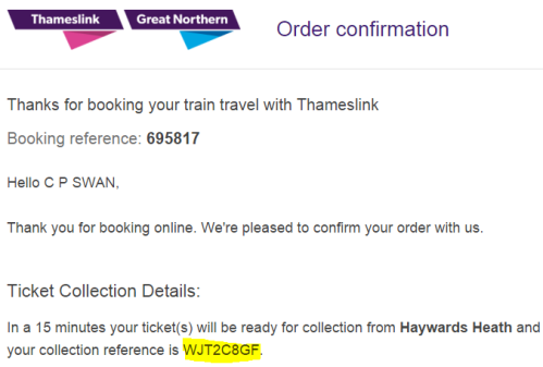
I’d also note that the email comes from Thameslink – not Southern who’s website I bought the ticket at. Some extra confusion for those unfamiliar with exactly how private enterprise has taken over our railway networks.
For the record the right thing to do here is put the number I need for the machine into the email subject – so I don’t have to actually open the email to find it when I need it.
Conclusion
The new Southern Railway ticketing website might look prettier than the old one, it might even be friendlier for occasional users, but it’s a disaster for frequent users like me and a terrible example of how too much attention to user interface can ruin user experience.
Notes
[1] Arguably the ticket itself is a receipt, but that’s not much help when it’s been swallowed by a ticket machine after a return journey.
[2] I have in the past been able to collect tickets just by presenting my credit card, which seems to me how things should work; and I’m struggling with what the threat model looks like for people picking up tickets with a card that ties to an order but that’s somehow illegitimate without the 8 character code presented at the time of the order (which a fraudster with card details would see anyway).
Filed under: could_do_better, grumble, technology | 1 Comment
Tags: Southern, ticket, train, UI, UX
Subscribe
Recent Comments
Tim Coote on Ross Anderson RIP iain on Skiing in Espace Killy (Val… Chris Swan on Getting more from a British Ga… Murray Cowell on Getting more from a British Ga… JL on AI MacGuffin  Pinboard.in bookmarks
- Why has Hugh Grant settled his phone hacking claim against the Sun?
- Open Source Security (OpenSSF) and OpenJS Foundations Issue Alert for Social Engineering Takeovers of Open Source Projects
- AI isn't useless. But is it worth it?
- Pluralistic: The true post-cyberpunk hero is a noir forensic accountant
- Subaru battery drain due to missing 3G network
- Paying maintainers: the HOWTO
- SARS-CoV-2 airborne infection probability estimated by using indoor carbon dioxide | Environmental Science and Pollution Research
- An unbiased evaluation of environment management and packaging tools
- Computer says no: British judge refuses to cancel divorce resulting from computer mistake
- Philosophy Museum


I share your pain. What a convoluted nonsense they’ve changed their previously highly functional online ticket sales website into. It’s like a Fisher Price version of a train ticket website for someone who’s never been on a train before, or never used the internet before. My local station is a Southern one but I no longer use their website to buy tickets.
If you go via TopCashback and then select East Midlands Trains, you can buy tickets for no fee for station collection and no credit card fee, AND you get 1.05% cashback for non-EMT journeys. Not a massive amount by anyone’s reckoning, but it is still free money for buying what you would anyway, and it adds up over a year. Just set up an email rule to dump emails from TopCashback into its their folder. I was expecting TopCashback to be a pain generally, but I’ve been pleasantly surprised how easy it is.
(here’s a referral link… http://www.topcashback.co.uk/ref/jaaydee )
And, hey, guess what — East Midlands Trains put the ticket collection reference in the email subject!!